CLAREMONT HOUSE
“Simone Haag is a talented, passionate, dedicated and connected design team. Simone has an incredible eye for colour and texture and the skill, intuitive and confidence to bring pieces together to create a beautiful home.”
~ Client
Having worked with the client twice previously, as well as with Angela Harry, we were able to reunite a well-oiled team that serendipitously had an all female constellation - something we all embraced. It was also a direction that fitted with the delicate ornamentation of the Federation home, the meticulous attention to detail Angela had paid to the restoration of its heritage features and the decision to canvas its walls in soft nudes and greys that drew short of being overly feminine while casting it firmly in that direction.
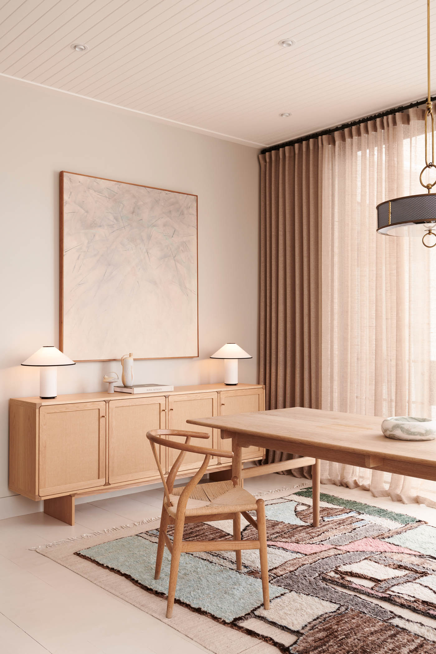
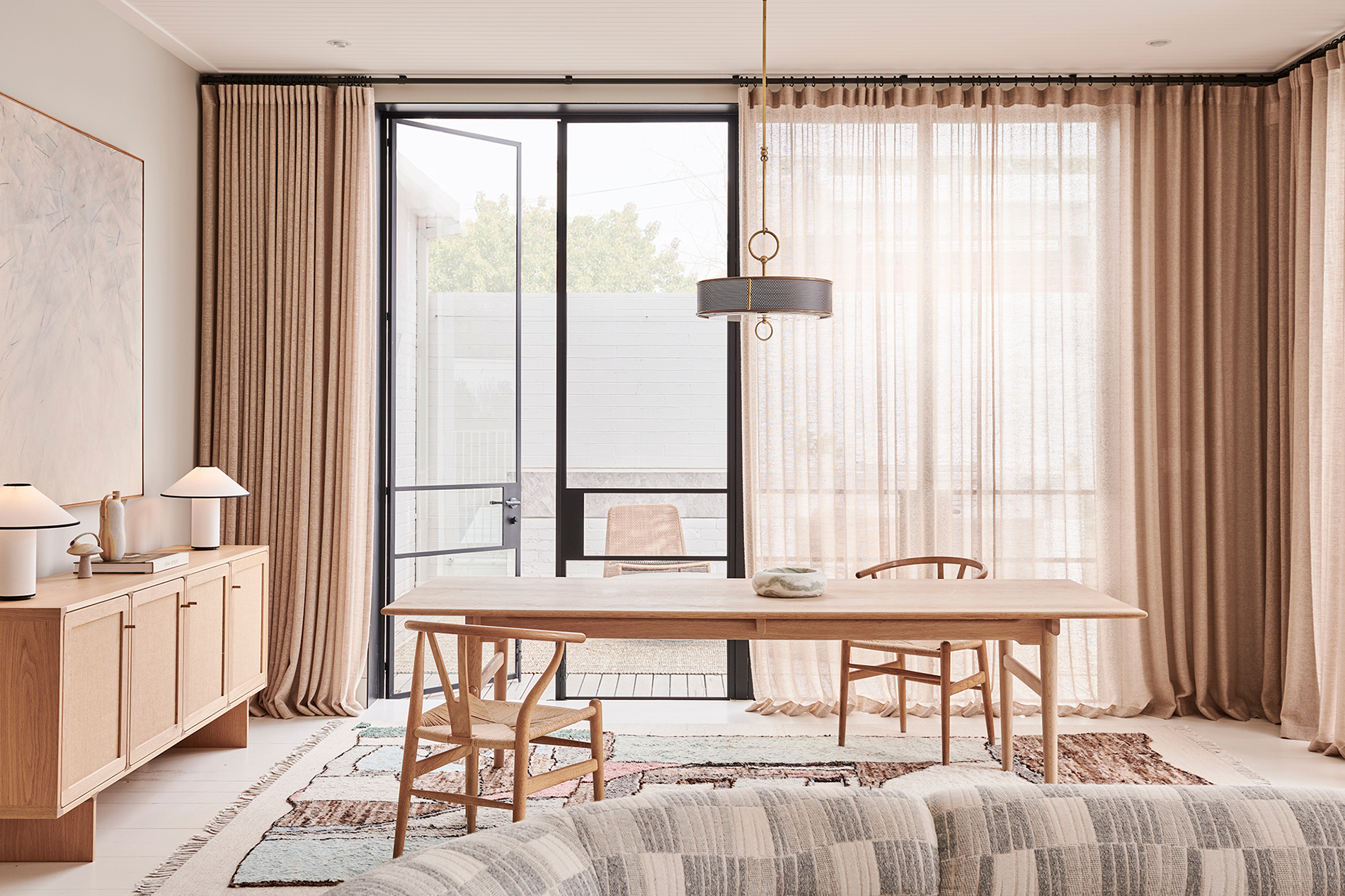
The client is a lawyer by profession and the renovation and decoration of her home was something she treated with joy - a welcome distraction from her legal work that manifested as a fun and collaborative energy. She was very decisive about what we brought to her and was supportive of anything that could be reused. Embracing this, we resurrected the kitchen stone and some pendant lights and worked with signature furniture pieces that still had lots of life to give such as her dining table. Having these welcome constraints perfectly showed where the gaps lay and where there was space to really through caution to the wind with the procurement of some truly stand out pieces.
~ Simone
“Simone and her team have brought richness, comfort and joy to my home through their creative, brave and carefully selected interiors along with a great deal of kindness, fun and laughter.”
~ Client
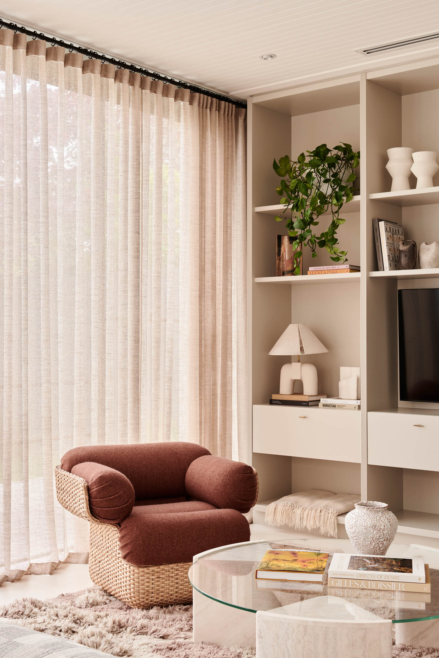
We started with three stunning rugs and from there worked pragmatically to bring rhyme and reason to each room alongside calm cohesion between them. The soft palette acted as a gentle foundation upon which we could layer expressions and gestures. As soon as you walk in, the gorgeous pink and grey striations of a console from En Gold crowned by an Ibiza mirror from Hommes set a tone of considered artistry that is carried throughout. Artworks pick up on the same colour scheme and then push it to its limits, coaxing pinks into rich russets and greys into marine blues. This gentle manipulation of visual cues was something we really had fun with, it led to the definition of rooms and serves to anchor the more expressive qualities of ceramics (via Trit, Catherine Dix and Michael Reid Clay), upholstery and furniture of unexpected composition with a sense of belonging, leavening them against Angela’s modulated interior design gestures while establishing Claremont House as a home illuminated by a distillation of warmth and light.