CUES FROM HUES
Our clients were a family of peripatetic travellers who had returned home to Australia. Despite having three adult children, they had purchased a large, Victorian home, with the aim of spending quality time as a family before becoming empty nesters.
"We have lived in over a dozen homes but this one was about bringing the family back together and creating a space that was filled with all the special things we had accumulated over more than two decades. Early on in the process of renovating, I hit a brick wall and needed design help. There are so many cookie cutter designers out there, but Simone’s work is different. It’s original."
~ Client
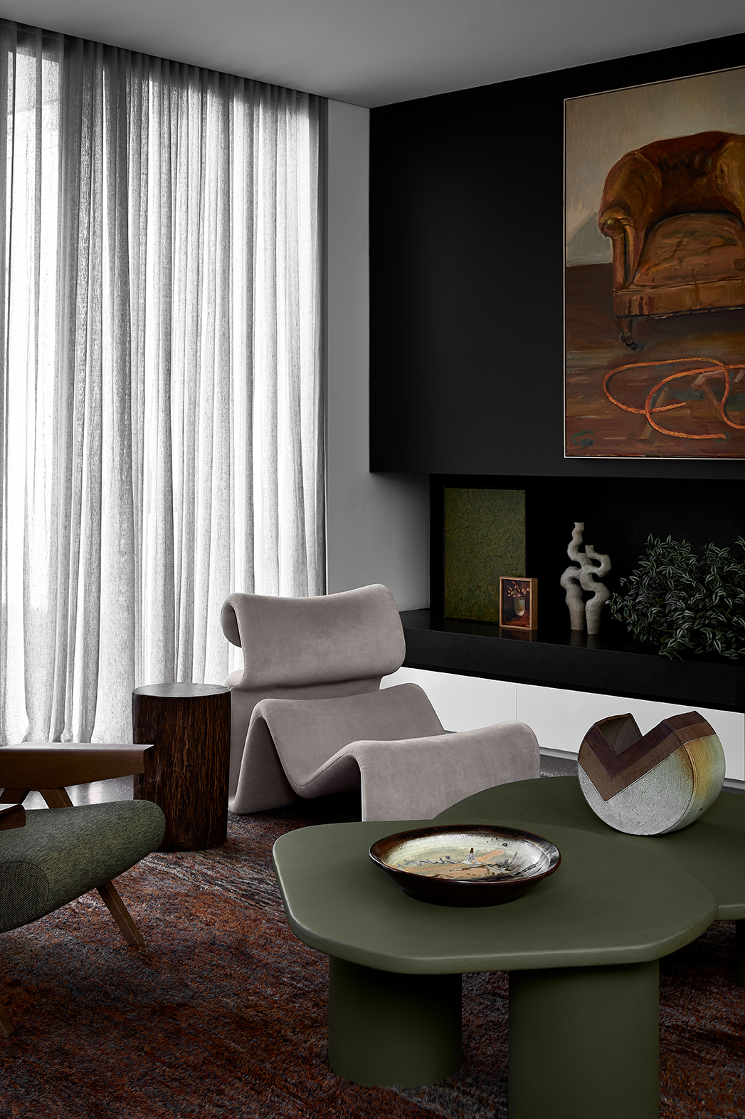
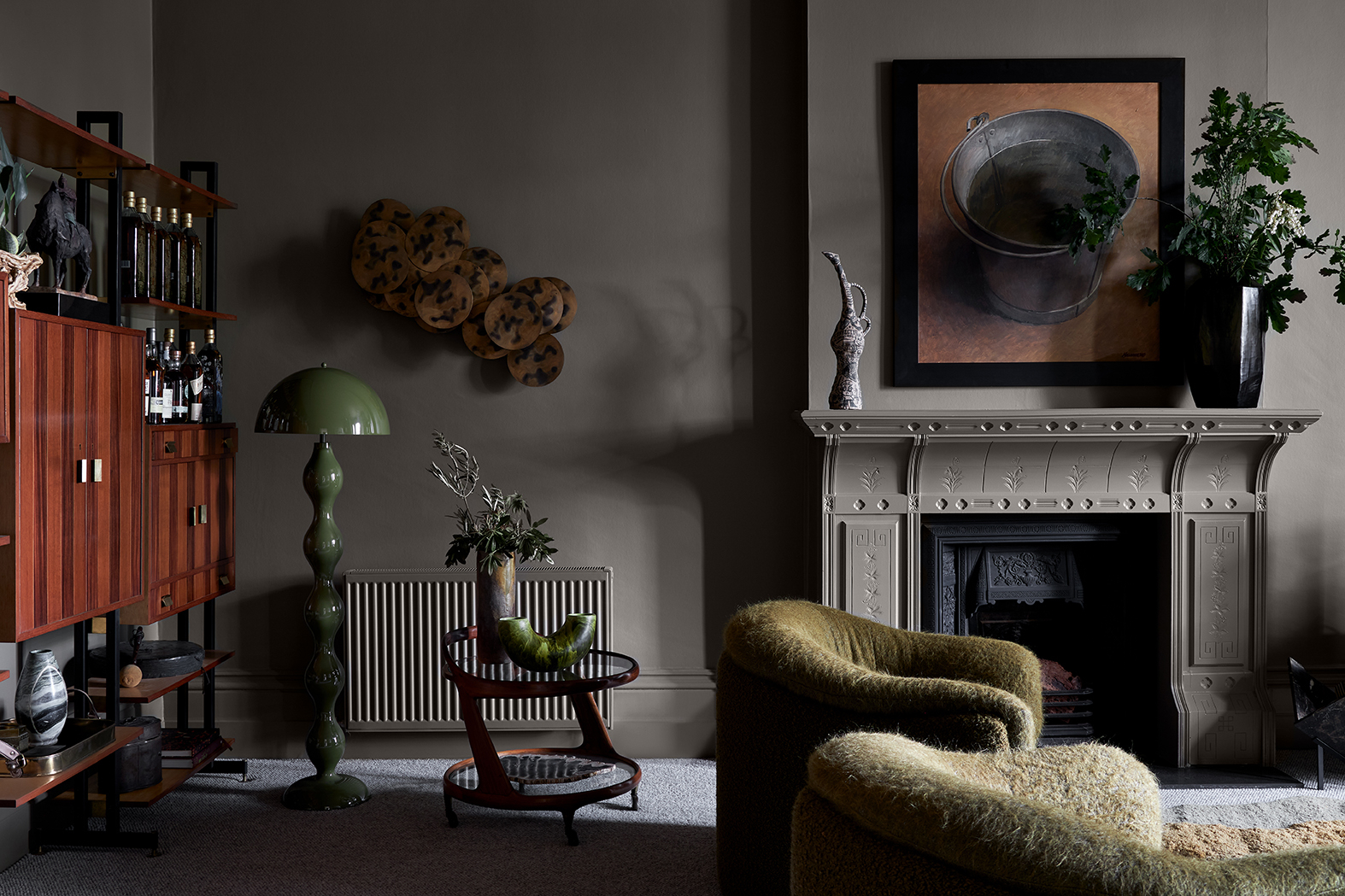
The client engaged us to design the interiors of an informal living room, the entrance area and the master bedroom. She had already made some bold moves, painting each space a shade of green. We used this tonal palette as the basis for our design concept.
"I didn’t want to create ‘the good room’. A room that feels precious and never gets used. I wanted a room where we could entertain friends and family with tunes being played or where we could watch a movie. Also a place where we can escape to when the children have their friends over."
~ Client
When working with a gutsy and adventurous client, we are driven to push the possibilities of place-making even further. The whiskey room (living room), became a receptacle for a diverse collection of pieces, both found and commissioned. Two client-owned bucket chairs were reupholstered in a combination of olive-toned mohair and bouclé, a treasured sheepskin chair was retained and we sourced a number of vintage pieces that collectively create a dynamic dialogue about style, form and pattern. The graphic Dedar wallpaper pulls everything together.
We also felt strongly about creating an atmospheric entrance space that would be welcoming as well as avant garde. The intentional clash of graphics, scale and form features a Tacchini 5-9 daybed, 7 Gronda Mirror and Coat racks and a stunning triptych by the Australian artist Kirsty Budge.
"We are so happy with the outcome. Whilst there were many ideas I adopted immediately, there were some that challenged me. Simone was always able to pivot to alternate suggestions that felt better for me, but didn’t dilute the overall vision in her mind. I always felt like we were on the same page and I completely trusted her and her team."
~ Client